|
1 2 3 4 5 6 7 8 9 10 11 12 13 14 15 16 17 18 19 20 21 22 23 24 25 26 27 28 29 30 31 32 33 34 35 36 37 38 39 40 41 42 43 44 45 46 47 48 49 50 51 52 53 54 55 56 57 58 59 60 |
做一个登录页,全屏背景图毛玻璃效果,实现方法如下: HTML: <body> <div class="login-wrap"> <div class="login-mask"></div> <div class="login-box"></div> </div> <script> var w = window.innerWidth || document.documentElement.clientWidth || document.body.clientWidth; var h = window.innerHeight || document.documentElement.clientHeight || document.body.clientHeight; $('.login-mask').css("height", h); $('.login-mask').css("width", w); </script> </body> CSS: .login-wrap { overflow: hidden; } .login-mask { /* IE6~IE9 */ filter: progid: DXImageTransform.Microsoft.Blur(PixelRadius=100, MakeShadow=false); -webkit-filter: blur(100px); -moz-filter: blur(100px); -ms-filter: blur(100px); filter: blur(100px); background-image: url(../../../img/background/home-bg-3.jpg); background-repeat: no-repeat; background-size: cover; background-attachment: fixed; background-position: center; position: absolute; z-index: 1; } .login-box { width: 300px; height: 400px; background-color: rgba(255, 255, 255, 0.5); display: block; border: 1px solid rgba(183, 183, 183, 0.47); border-radius: 6px; position: absolute; left: 50%; margin-right: auto; margin-left: -150px; margin-top: 10%; z-index: 2; } |
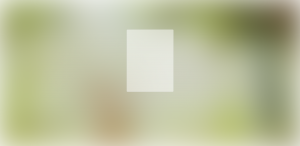
效果如下:

可以发现边上是有白边的,这是一种blur的值很大的情况下。此时的解决方法是直接将background-size:cover;改成background-size:150% 150%;就行了。
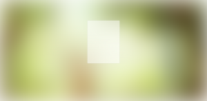
效果图如下:

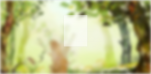
仔细看可以发现白边不那么明显了。 另外一种就是在blur的值比较小的情况下,比如将上述的blur值改成20,
效果如下:
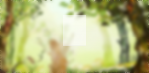
可以看出白边很明显,这时候如果给body添加同样的背景图的话,白边就会消失:
|
1 2 3 4 5 6 7 |
body{ background-image: url(../../../img/background/home-bg-3.jpg); background-repeat: no-repeat; background-size: cover; background-attachment: fixed; background-position: center; } |
效果图如下:
可以看到边缘的区别很明显。但是对比有点明显,效果并不好,将blur的值再改小一点,改成5,效果图如下: 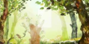
边缘的白边去掉了,并且看起来不是那么违和了。 如果你觉得按照第一个方法做出来的效果背景太亮的话,
可以使用滤镜来变暗一点: background-color: rgba(141, 141, 141, 0.35); background-blend-mode: darken;
效果如下: